A Picture that Gets a Point Across.
 This image is making a big splash on the sports blogs this morning. (It's originally from StrangeMaps, but I found it on Deadspin.) It does a good, if controversial job, of showing the geographic allegiances of the various parts of the country to the nation's baseball teams. (Do the White Sox really only have the support of parts of Northern Illinois?)
As an empirical researcher, I'm constantly thinking of ways to depict complicated statistical information visually. Of course, some people think almost exclusively about this question. Tufte's books
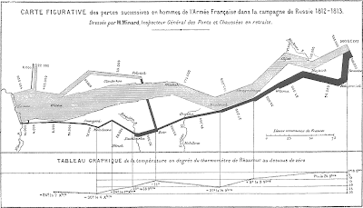
 are on so many of our desks because they are filled with brilliant examples like the one at left. It shows Napoleon's disastrous invasion of Russia in 1812. It manages to show how the 422,000 troops who left France gradually were whittled to 10,000 as they were routed from Moscow and the temperature (bottom line) dropped.
What's so important about depicting information graphically is that so many people have such a difficult time processing numbers. People whose eyes would glaze at numbers in a table suddenly get it when you can make the numbers come alive for them. It doesn't really matter what the numbers say if you can't find a way to effectively communicate them to an audience. Similarly, you can make an audience think your data say something they do not by presenting them in a misleading way.
Is there a figure or chart that you think does a particularly good job of conveying something complicated in an effective way? In an ineffective or misleading way?


3 Comments:
Any Detroiter knows there are issues with the baseball map. The line between Ontario Tiger fans and Ontario Blue Jay fans cuts right through London, Ontario. I think there is even a bar commemorating it.
Yes, the map is misleading. The area for the Devil Rays may be correct but it would be more accurate to just give the addresses of the 11 fans.
Also, the far reaches of the western part of the Upper Peninsula of Michigan are really Wisconsin, and Brewers country.
Ask any lawyer from Detroit, technically licensed, who appears in a court in Escanaba or Menominee, if one is still really in Michigan.
Post a Comment
<< Home